 I’ve just returned from my annual visit to Tresco as part of an artist’s residency with Gallery Tresco. A short 20 minute flight from Lands End, in an 8 seater plane to St Marys and a bumpy boat ride from St Marys to Tresco and you’re there. Unfortunately, our flight was delayed by 2 days due to fog and high humidity, which meant we only had 4 days staying on the island. Luckily, time slows down on Tresco and it felt as if we’d had much longer. One of the joys of visiting in the winter means we have the island pretty much to ourselves, a real luxury. We stayed in the most stunning house, with sea views and steps going down to the beach. Just gorgeous.
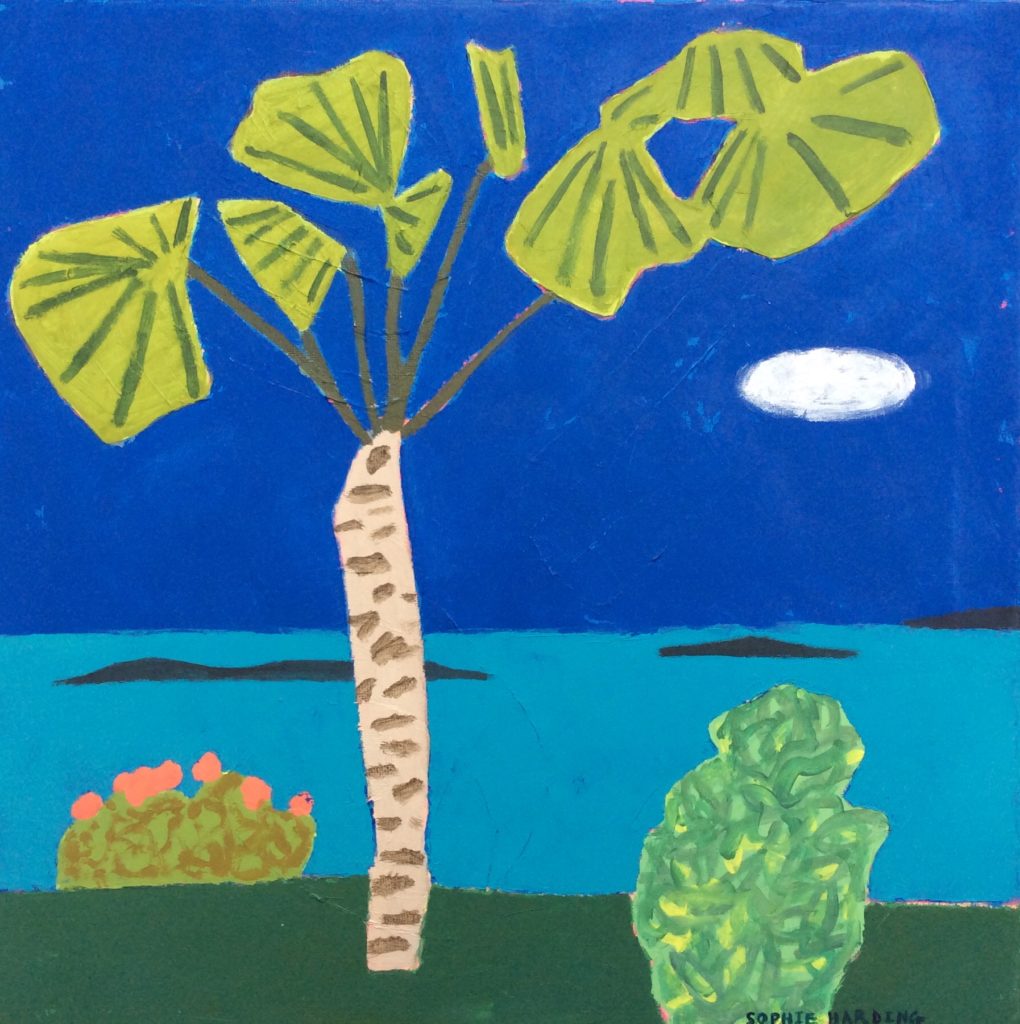
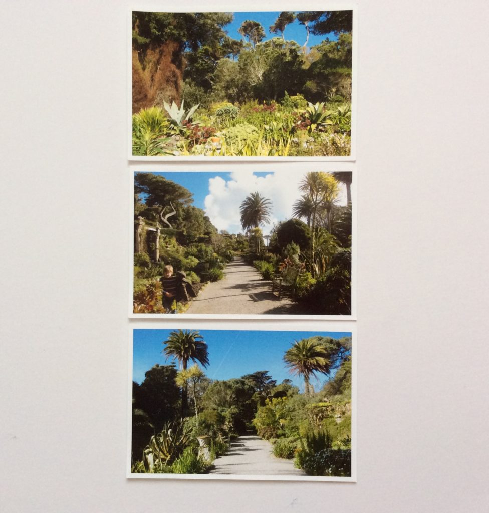
 I concentrated on making daily sketches of the Abbey Gardens as for me they are so inspiring due to an abundance of exotic plants, flowers and trees. I’ll really enjoy creating a new collection of work based on my drawings. We were also lucky to spot some of the rare wildlife- red squirrels and golden pheasants.
Each day a different robin (I only know this because one was quite fat and extrovert and another was shyer and slimmer) came and perched next to me whilst I was sketching. One day it trilled a song whilst making eye contact with myself and my son!
I’m ensconced in the studio now, preparing new work for the May Show, starting on 14th May 2020.
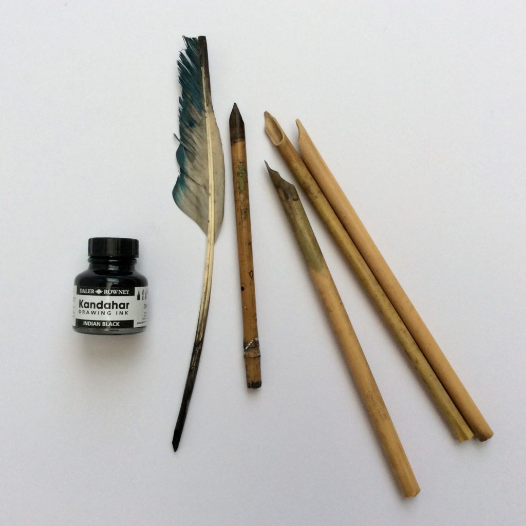 My favourite 2019 Christmas presents are handmade bamboo dip pens, black drawing ink and a couple of quills. These are such a joy to draw with as there’s an element of surprise and slight lack of control which makes for interesting marks and effects.
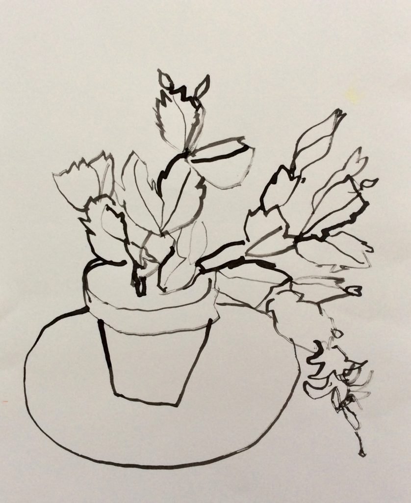 Here’s one using my left hand. A beautiful flowering cactus, a present from a friend.
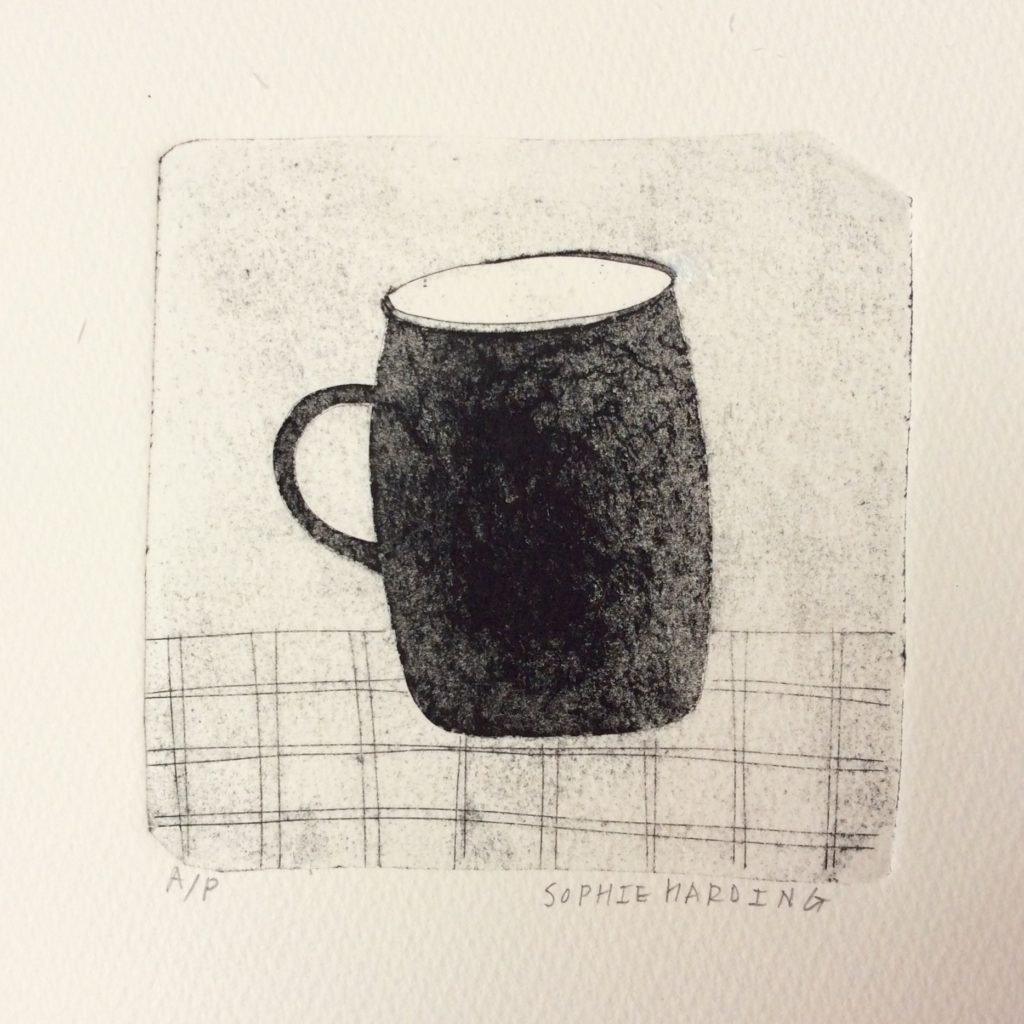
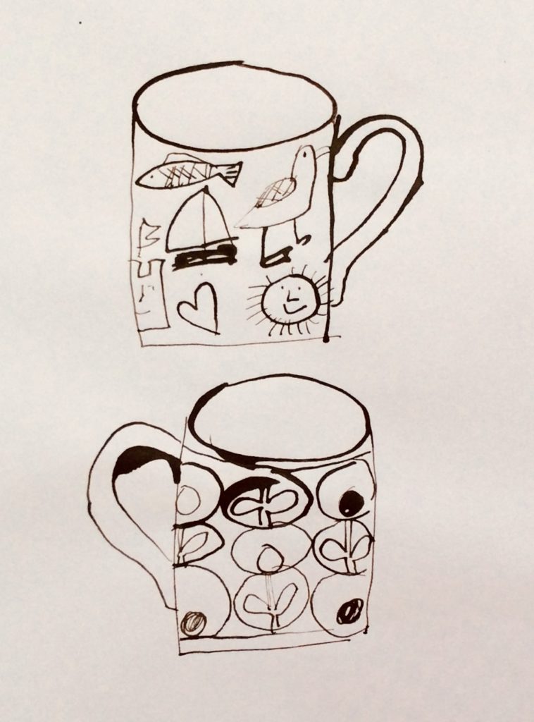 Two cups, using a 30 year old quill, made and used by my son’s dad whilst at art school.
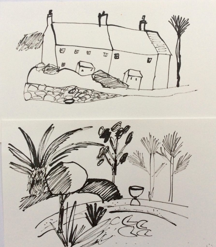
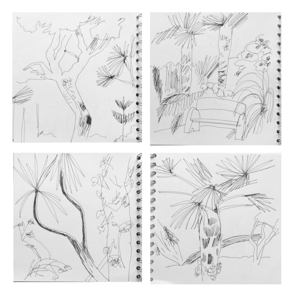
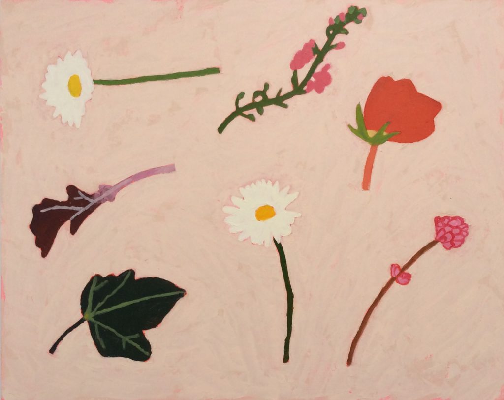
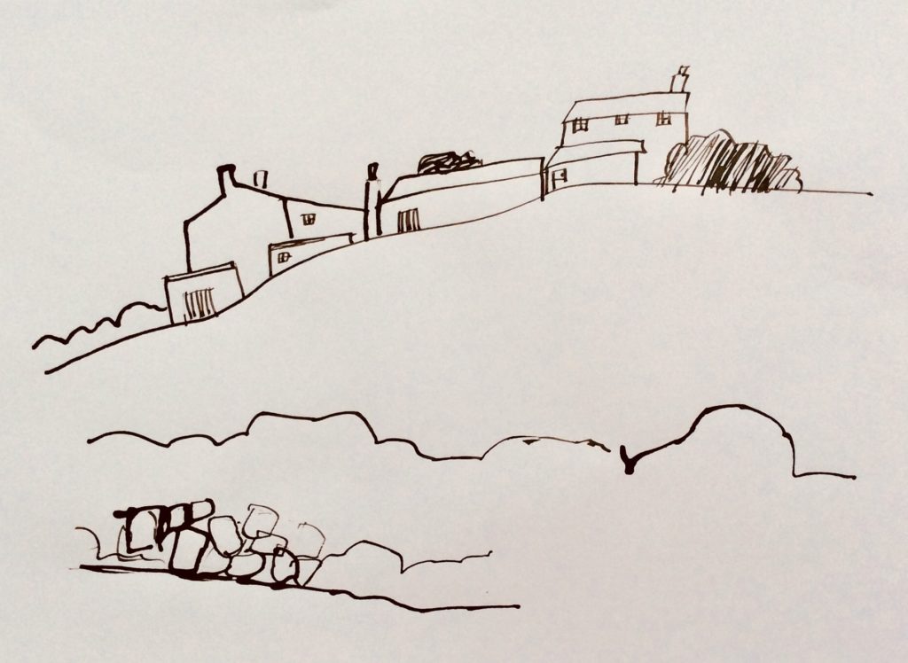 A selection of Tresco inspired sketches.
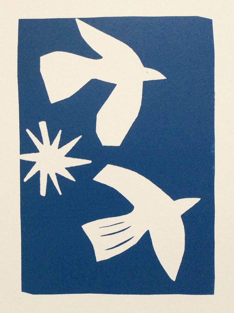
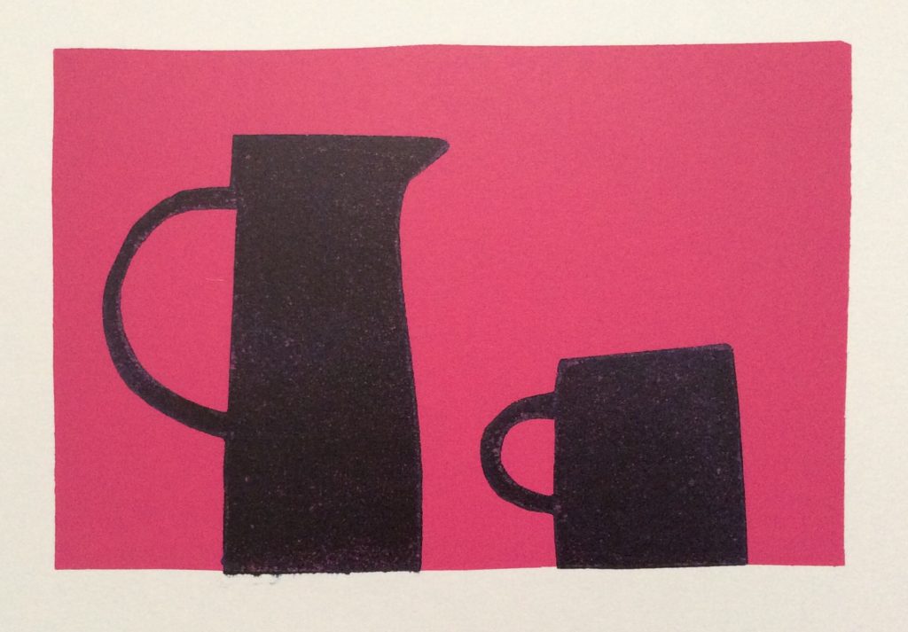 I’ve just completed my second term learning printmaking at Penzance School of Art. I’ve loved it so much that I’m going to continue signing up for the foreseeable future. It’s one morning a week for 2.5 hours. Very doable in between my usual work schedule.
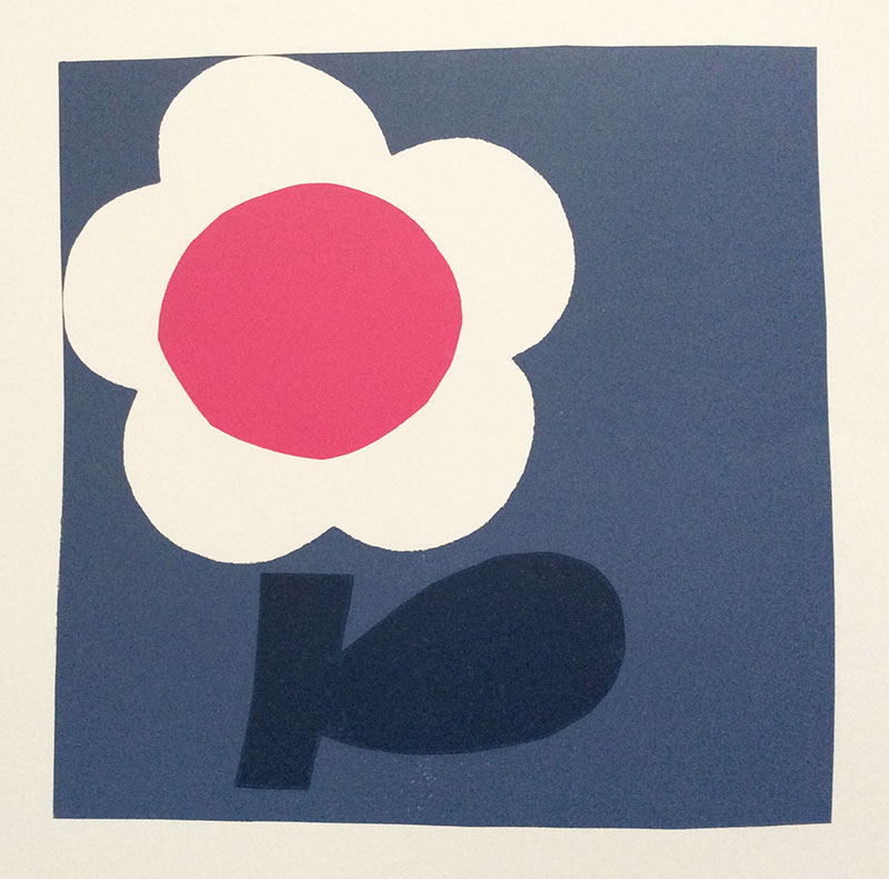
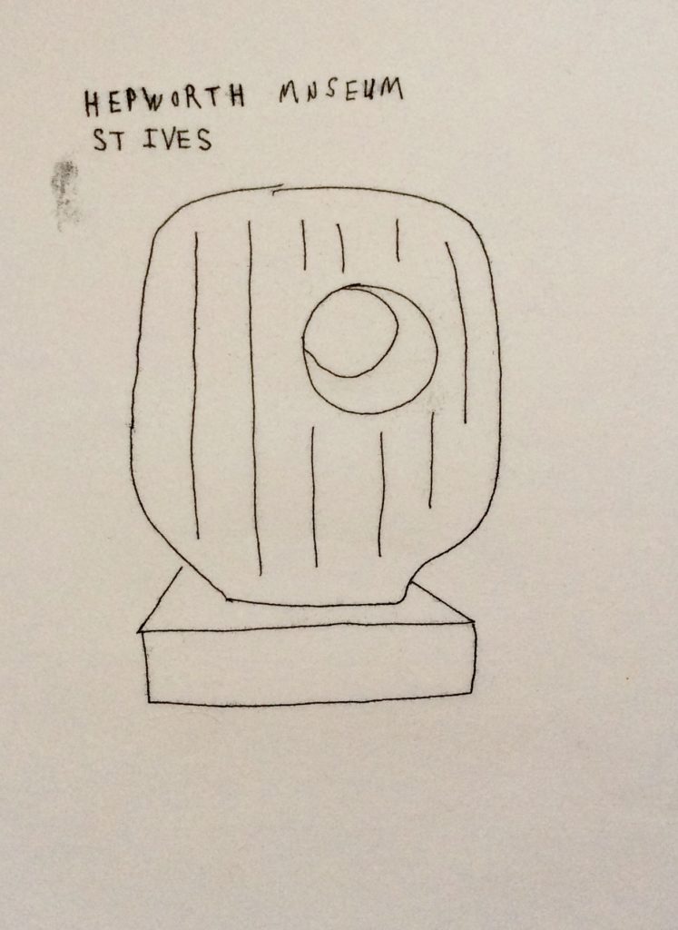
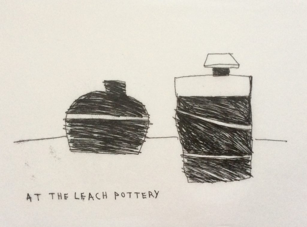
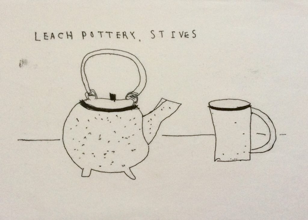
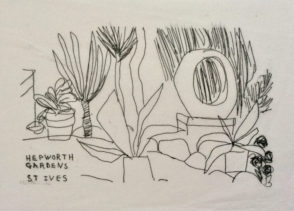
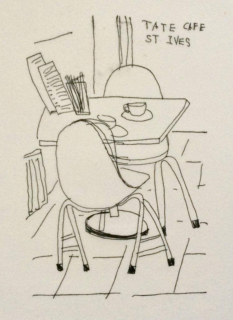
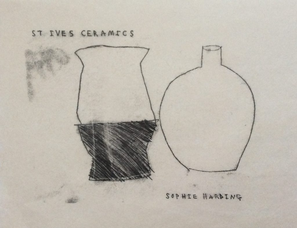
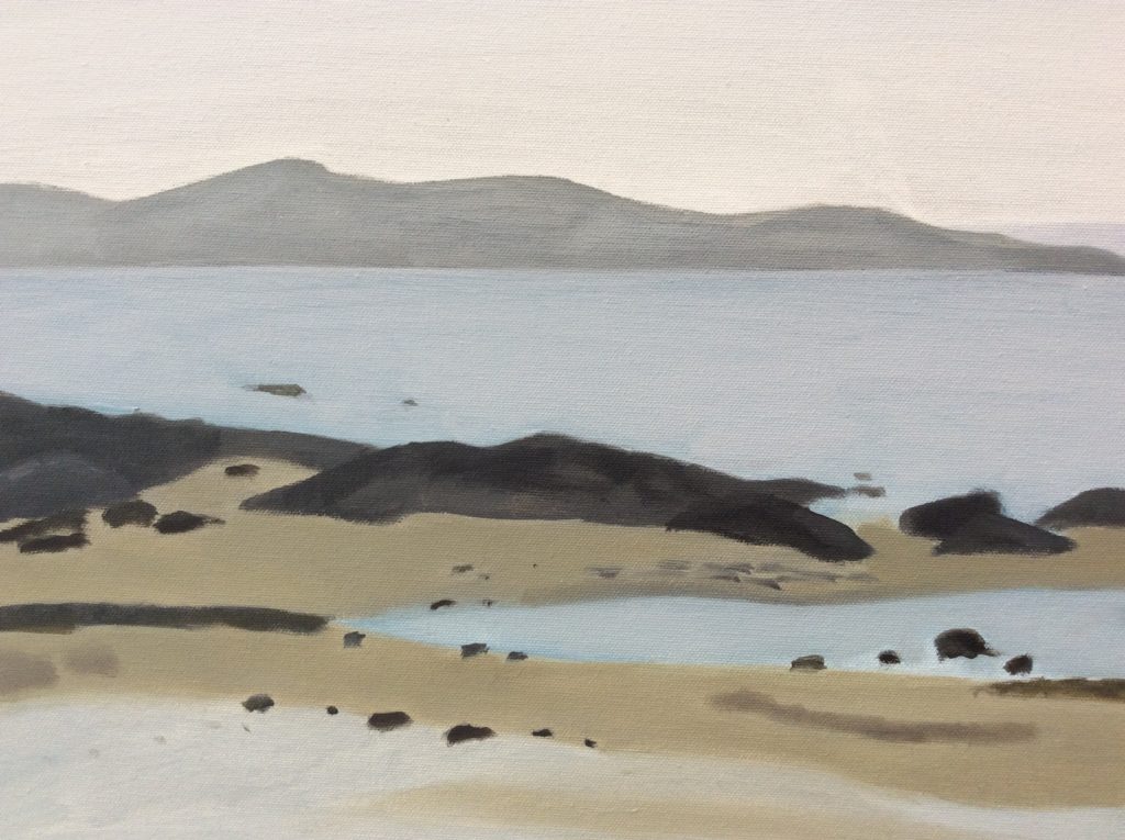
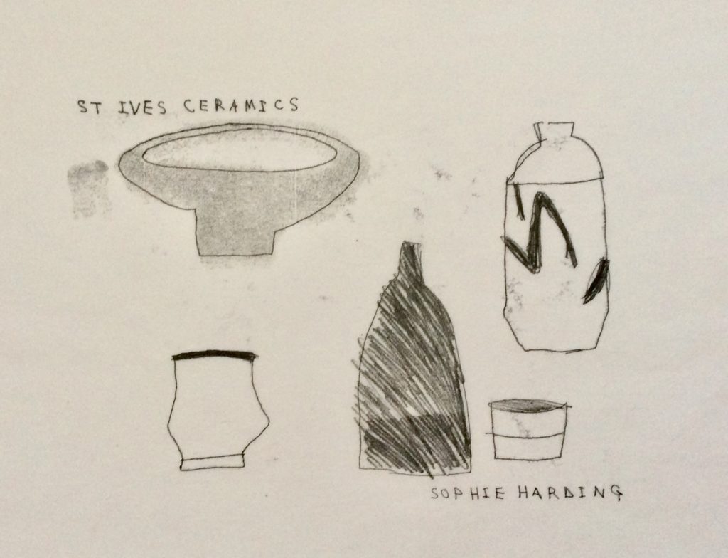 I’m lucky to live around a 20 minute car journey from St Ives. Over the last couple of years I’ve purposely taken my sketch book with me when visiting and I’ve now acquired lots of information to use within my work.
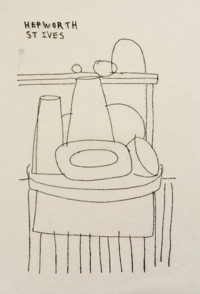
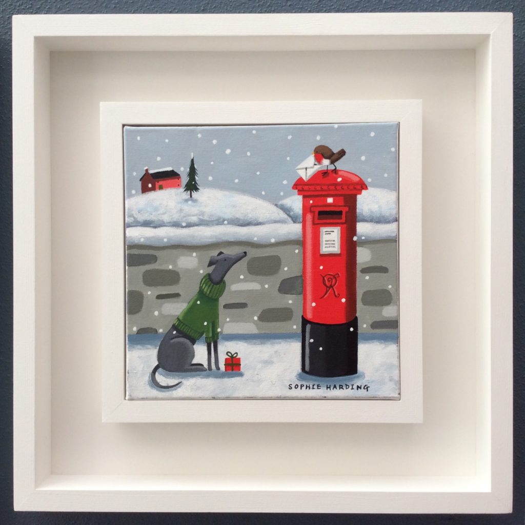
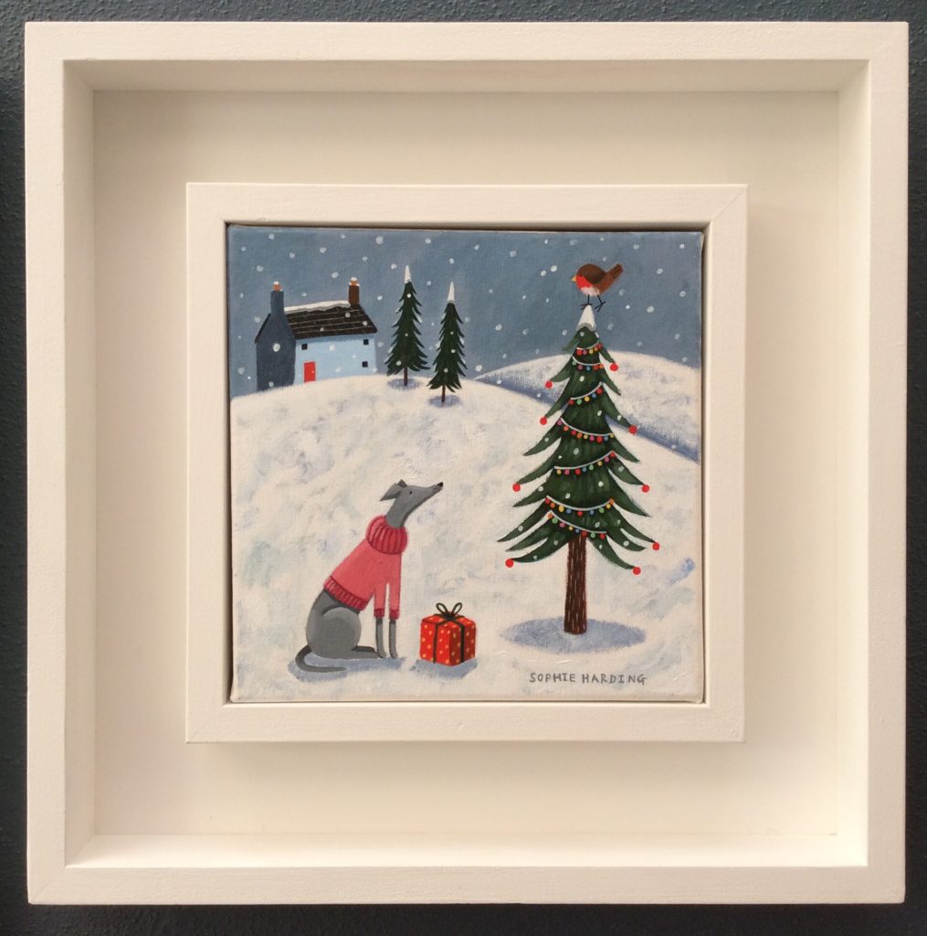
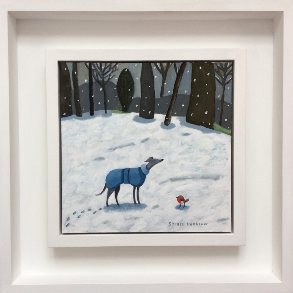 I’ve been designing various whippet themed creations for around 16 years since acquiring my first rescue whippet/ lurcher.
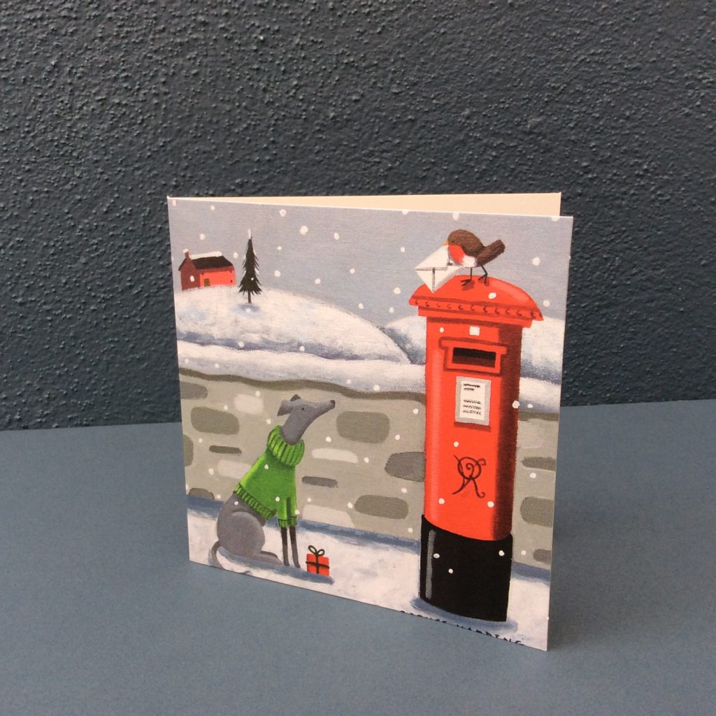
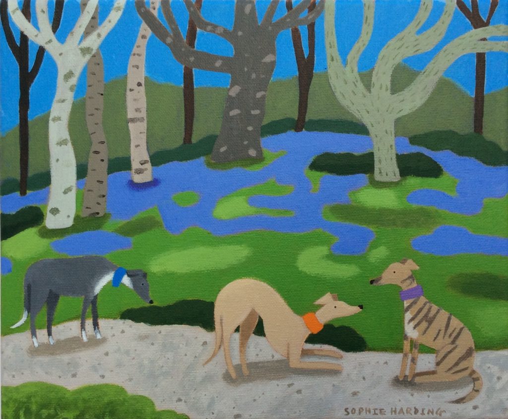

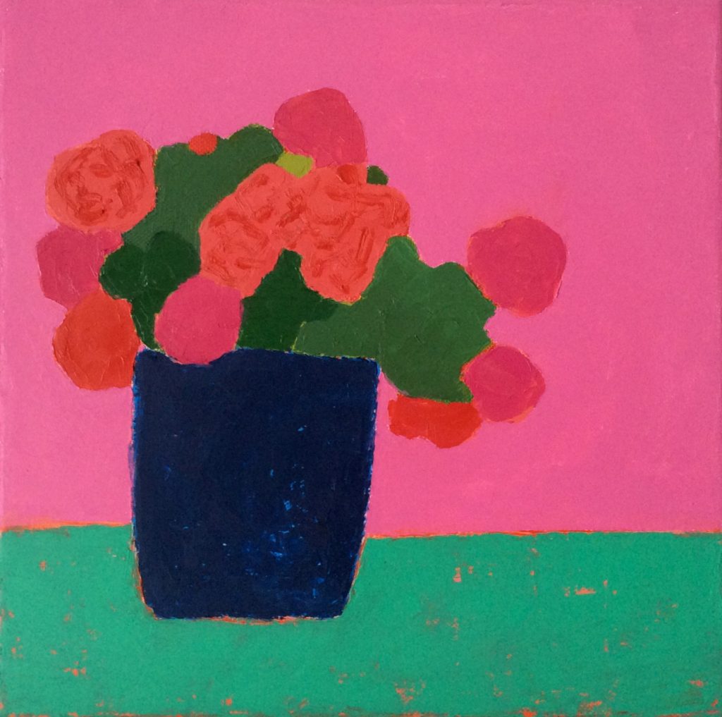
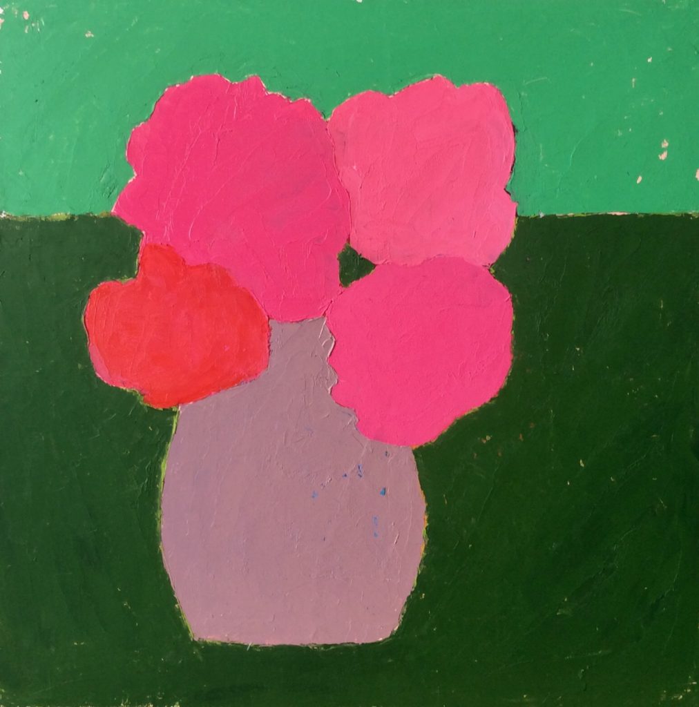
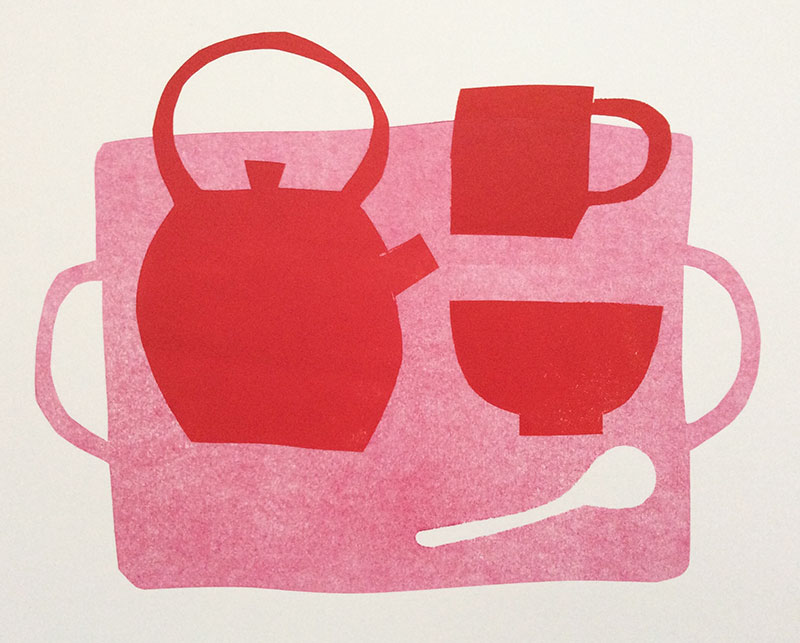
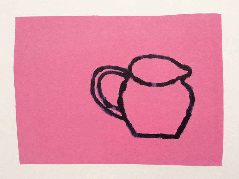
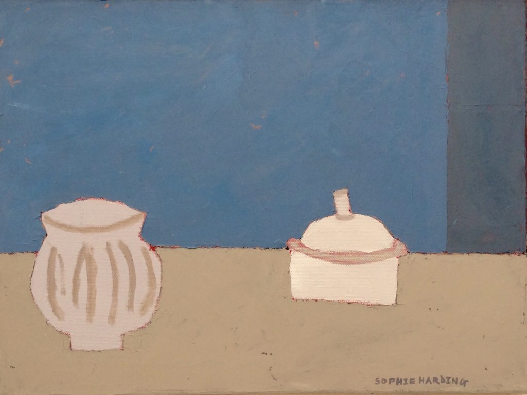
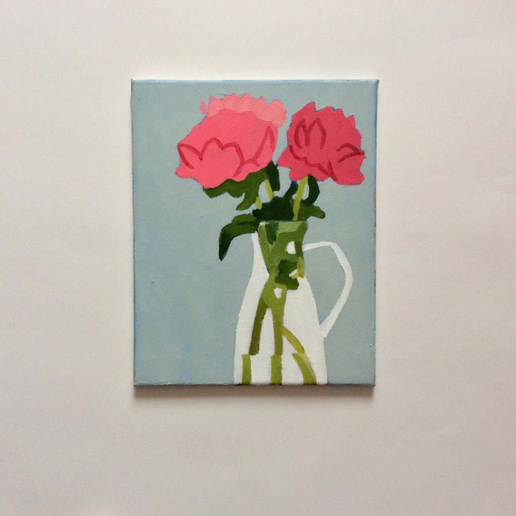
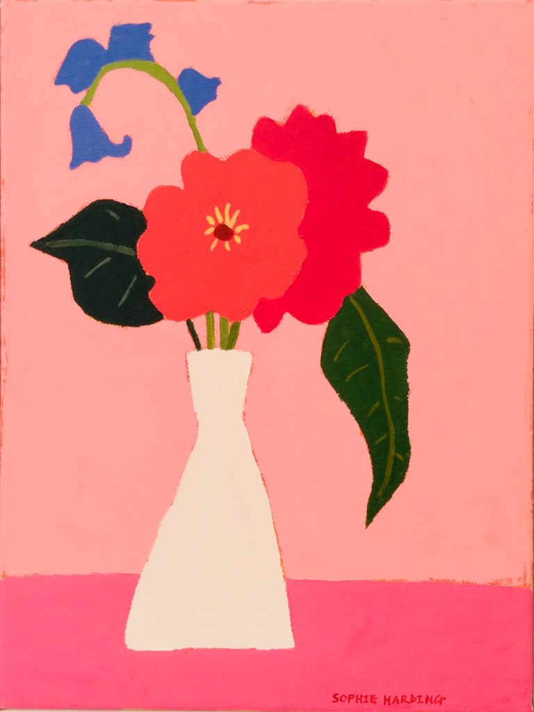
 I tend to veer towards a vibrant colour palette but sometimes it’s refreshing to tone it down. Plus it’s a good learning process mixing new colours and seeing what works.
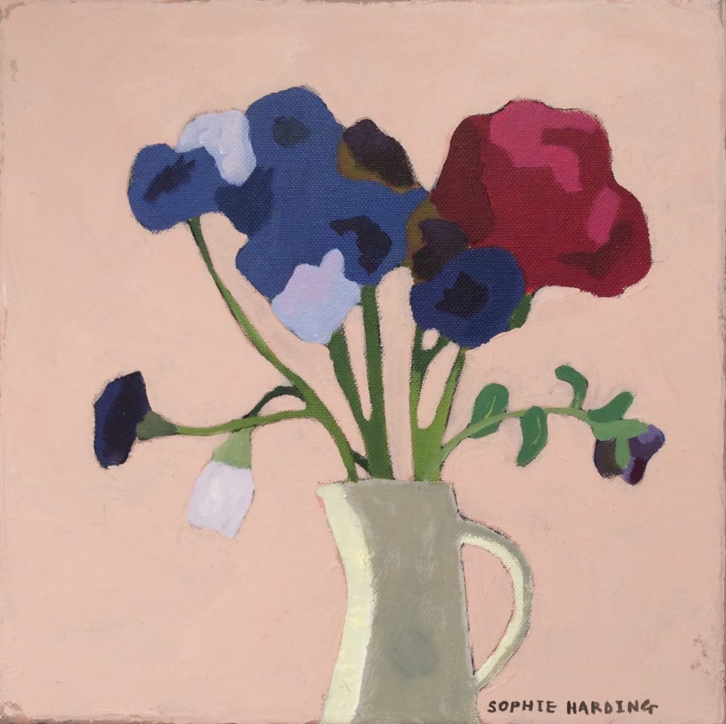
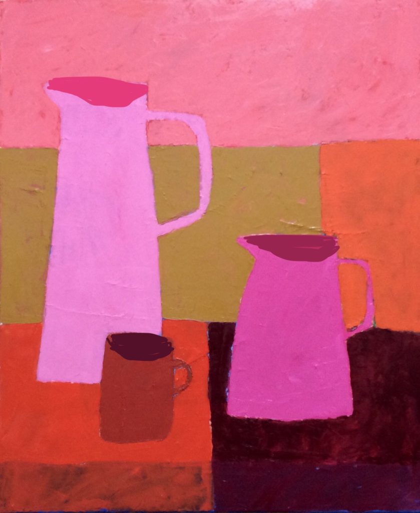
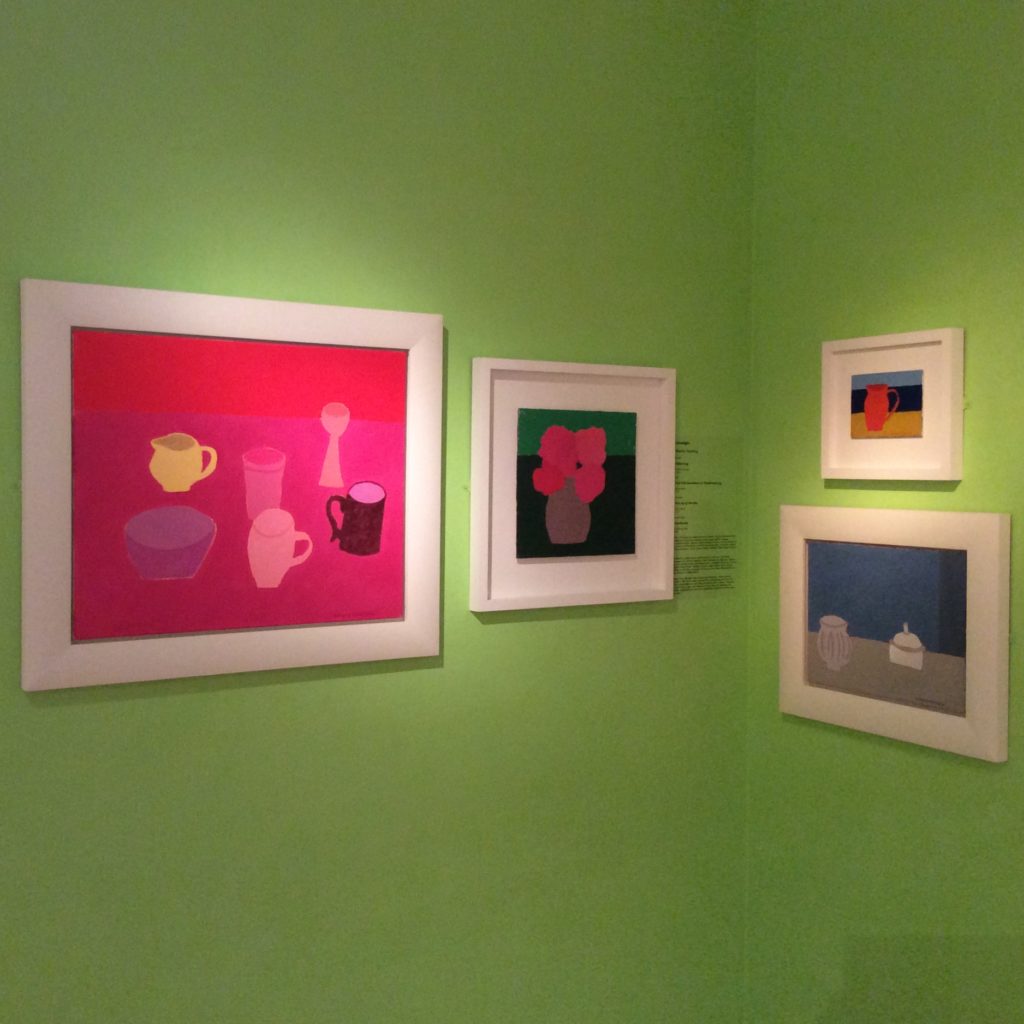 A small selection of my paintings are on view at
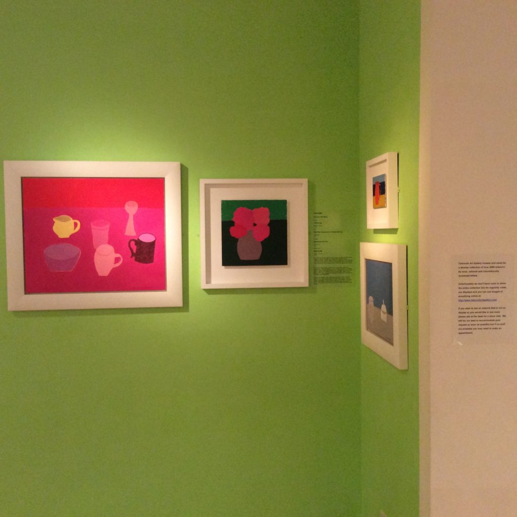
 Towards the end of October I’m having a small show of my new collagraph prints at the gorgeous
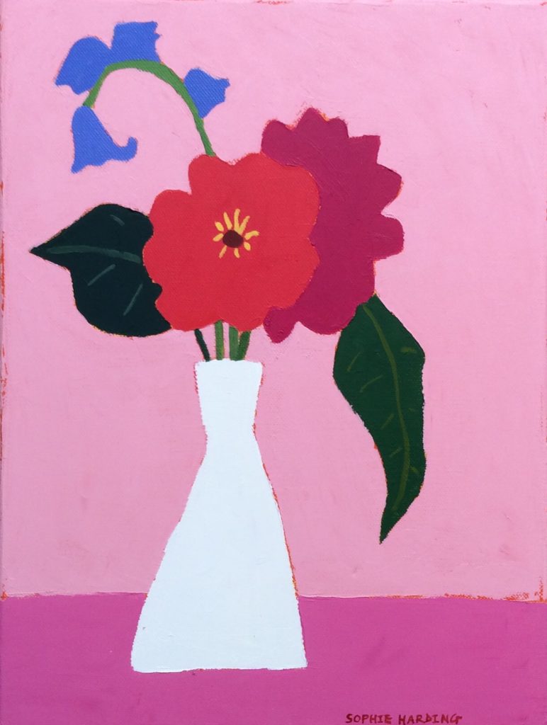
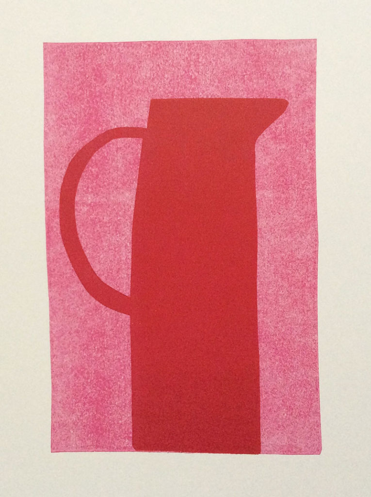
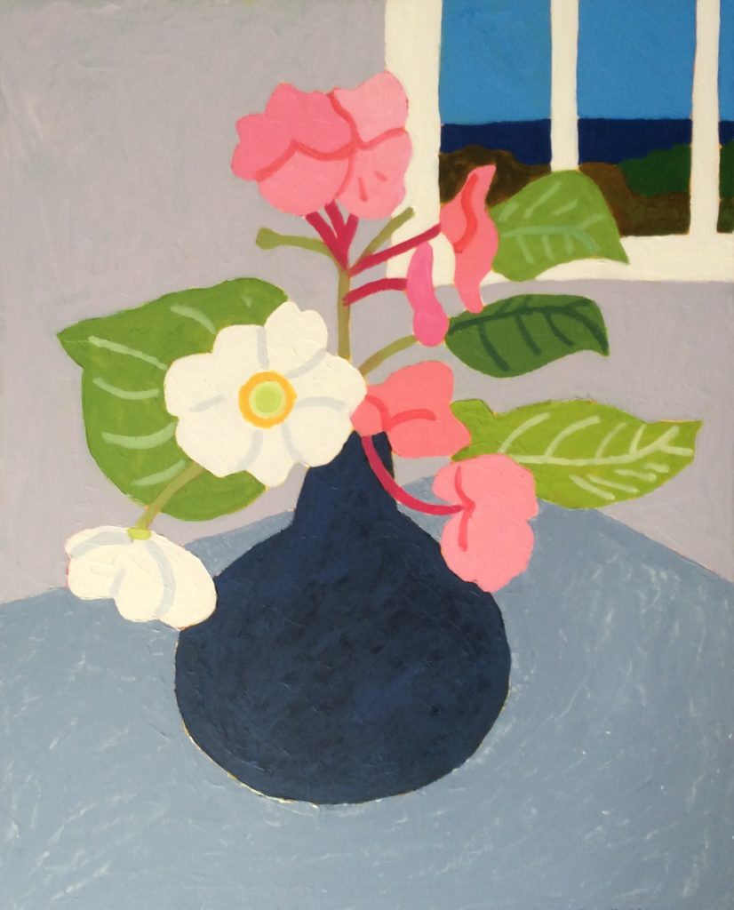
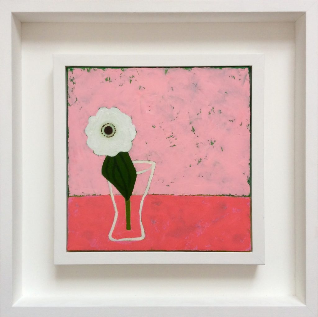
 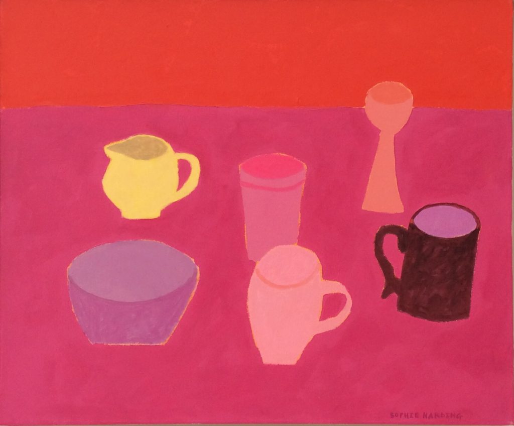 My work is primarily driven by colour and the power is has to evoke positive emotions. Colour can actually lift your mood or depress it. Years ago I studied colour theory whilst on foundation, weeks of it…these days I tend to use colour intuitively without getting caught up in the theory of it. The combinations are endless, that’s why it’s so interesting.